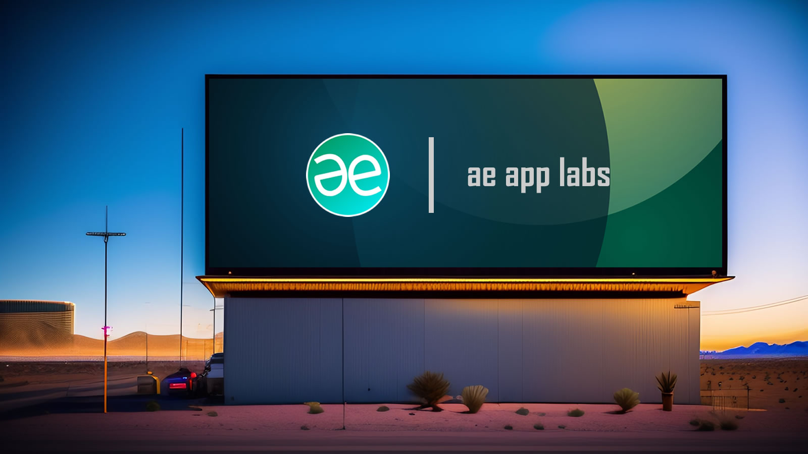
The Brand of AE
Branding
The history of creating a unique brand identity for ae.
AE (Artistik Expressionz) specializes in creating exceptional user experiences and interfaces.
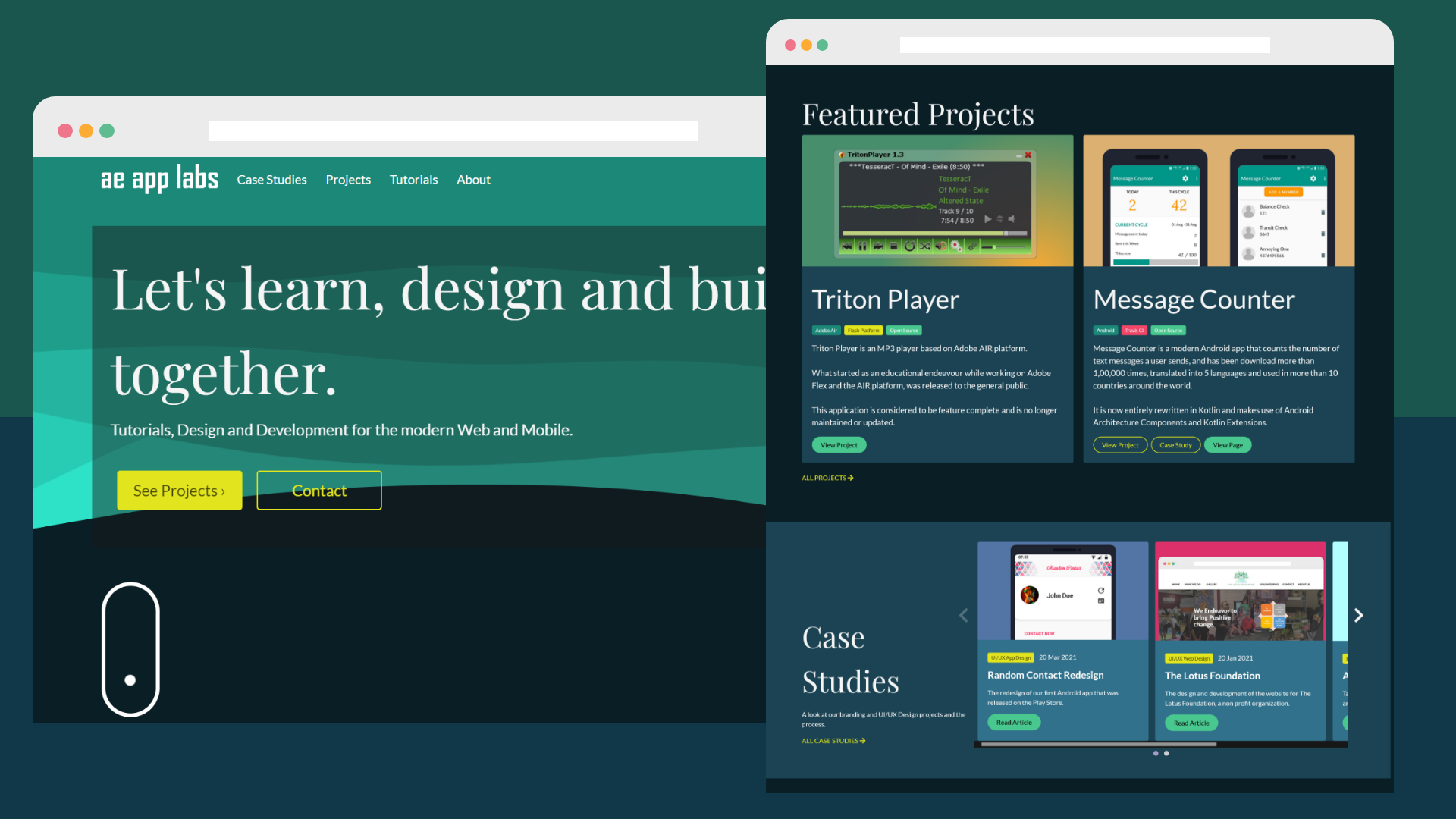
We recently redesigned our org page, shown above.
#156f62
Primary Dark
#48c78e
Primary Light
#e2e41d
Accent
#1B4353
Card BG
Headings - Playfair Display 4.5 rem
Title - Lato 3 rem
Subtitle - Lato 1.25 rem
Lorem ipsum dolor sit amet consectetur, adipisicing elit. Obcaecati, amet magni! Repellat voluptate commodi, praesentium labore nesciunt provident similique. Provident nulla soluta ut possimus, tenetur eaque tempore quasi? Laborum, qui?
The main buttons are with the accent color and also have an outlined variation.
And the secondary buttons, are smaller, in Primary light color and also have an outlined version.
Large Tag
Medium Tag
Tag One Tag Two Tag Three
Tags display additional information and can come in different sizes. They have rounded corners to distinguish from the buttons which can be interacted with.
Evolution of the logo
The very First
The initial and short lived logo for AE was very simple, but blocky.
2005
It was created with Adobe Flash as a vector graphic.
The Retired
The most widely used logo was a little bit more creative and designed to emphasize symmetry.
2005 - 2020
It was also created with Adobe Flash as a vector graphic.
A Modern Approach
The logo was simplified while retaining the idea of symmetry. Also a dash of color with a slight gradient was added, with alternate monochrome variations as well.
2020 - Present
It was initially created with Adobe XD as a vector graphic, then redrawn in Figma by 2022.